Forward Conference
Four Winds Interactive hosts a visual communications conference annually. The purpose of conference is both to teach people how to better use their digital signage and to bring in sales. For the attendees, it’s an opportunity to bring together the community of digital signage users to network, ideate, and leave empowered. They needed a brand that would excite and entice along with an app that would connect, educate, and empower conference attendees.
challenge
Create an app that helped conference attendees engage before, during, and after the conference.
Role
Branding
UX Studio
UX Research
UX/UI Design
Squarespace Site
Discovery
Since Forward was in its third year, there were previous attendees eager to share how an app would help them get more out of the event. The main developer and I called and interviewed numerous previous attendees. We quickly learned there was a ride range of desired features. We also talked with internal FWI stakeholders who shared their vision for what an attendee would use the app for.
We then led an in-house UX Studio. Here our test group sketched out their ideas on the app’s functionality along with its structure and layout. It was a card sorting + wireframing + brainstorming session all in one. This was my favorite part of the process because at the end of it we had a large pool of ideas, features, and wireframes. We took this back and compared it to the data from our user interviews.
I also researched several other conference apps to see what users expected when opening a conference app for the first time. With all this data and research collected, I moved onto the visual design.
See some of the sketches that came out of the UX Studio below.
Concepting
Taking the wireframes from the discovery phase, I moved onto low-fidelity wireframes in Sketch. Initially, based off the business goals of the app, the wireframes included a gamification piece. But, after talking with the users, this became an unnecessary feature. Rather than add friction to their app experience by forcing them to participate in the gamification of it, we removed it and focused on ensuring they’d see exactly what they needed.
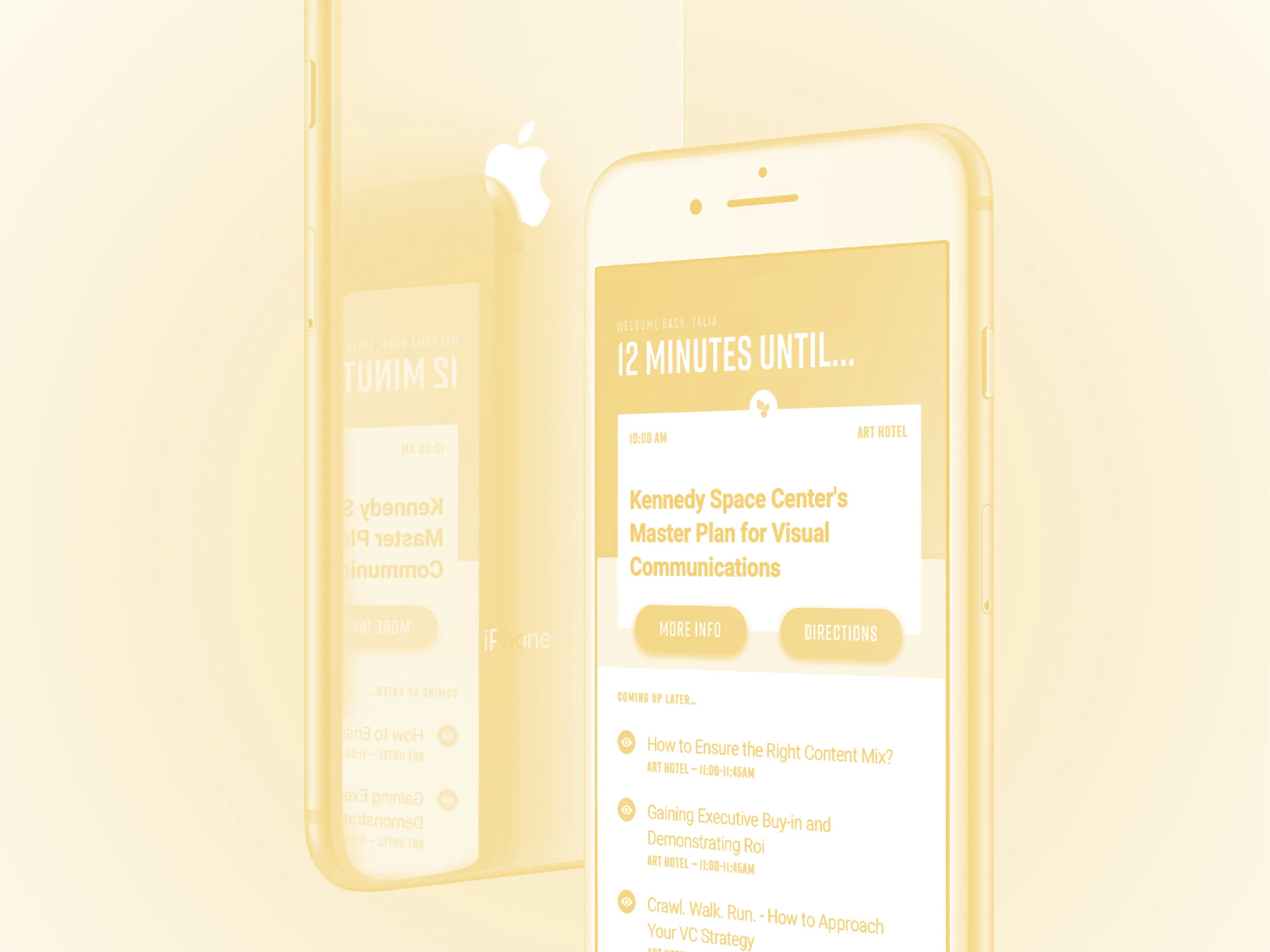
The main page of the app gave the user a countdown of how long they had until their next session. (Since they registered beforehand with the same email they used to login to the app, the app was preloaded with all of their session details.) This allowed them to see exactly where they needed to be and also gave them a preview of where they’d have to go after their session was over.
Since a majority of our user feedback focused on how they were going to the conference to network and learn, we wanted to make those key benefits of using the app. Not only could they email people they met in the sessions through the session detail page, but we uploaded the content of the session to be viewed at a later date. That way in case they met someone in a session but forgot to grab their card, they’d still be able to follow up afterwards. And, if they missed a slide or needed it several months later, they’d be in luck.
See some of my initial wireframes below.
Outcome
After working for several months with a developer, the app launched a week before the conference. The conference then brought in $40k in revenue and hosted over 200 people.
We realized that next year we needed to do more backend tracking to see if people were downloading the content from the sessions onto their phone. But, the structure of the app was reused again the next year with additional functionality added to it as the software Four Winds Interactive develops improved.


