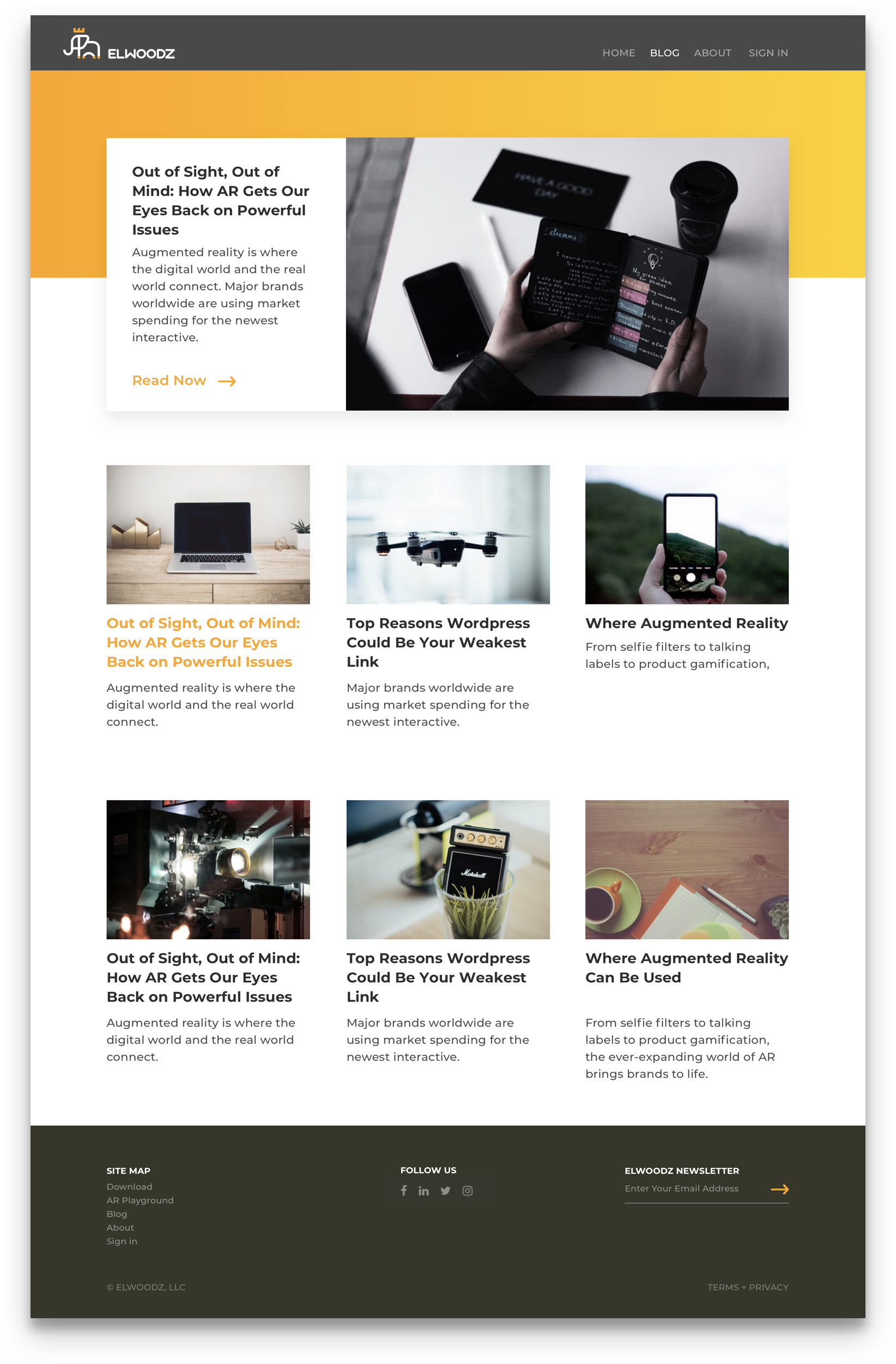
Elwoodz Site
As a startup specializing in bringing brands to life, Elwoodz had a couple goals. ONE They needed a user to know that Elwoodz was first and foremost focused on providing immersive AR and beacon technology experiences. TWO They wanted to ensure confidence in the bread and butter services that came along with hiring Elwoodz.
challenge
Ensure users understand both AR and beacon technology but also will still choose Elwoodz for any other creative technology needs.
Role
UX Design
Strategy
Web Design
Discovery
Since I was working as the sole UX/UI designer with only three days allocated for the project, I had to move quick. There wasn't a lot of time for process, which was all the more reason to be efficient.
Elwoodz had an existing site, so I started by interviewing the team on the goals of the site update. This led to narrowing down exactly what information needed to be on the page. The old site didn’t speak to AR or beacon technology. This was the major pain point as this was now the main business of Elwoodz.
Research showed that augmented reality was still in the early adoption phase. This meant many people (including our desired user, the forward-thinking marketer) might not realize its potential for their business. It was critical to clearly and concisely convey how AR could help them tell their brand story in a new way.
I also did some research on the general AR competitor market. I wanted to ensure the Elwoodz site would allow our target user one major thing: walk away confident Elwoodz was the AR company to partner with.
See some of the pieces of the discovery phase below.
Concepting
Through high fidelity wireframes, I quickly designed the pages of the site. I worked with the developer to ensure the things I was asking for were feasible. And, I worked with the copywriter to ensure the design and copy worked together to create a cohesive experience.
Elwoodz’s CEO wanted a purpose statement to greet users upon arrival. His goal was to partner with companies rather than be just another agency, and this statement helped communicate that right off the bat.
The “Try AR” section ended up being the most difficult to ensure a seamless, empathetic user experience. When the 1-2-3 step wasn’t making sense, we went back to the drawing board. The end result was an experience where the user texted the app download link to their phone. This reduced the number of steps, made the process smoother, and even allowed us to track who downloaded the app after coming to the page. (The design thinking process led us to make the decision to remove this feature from the mobile version of the site.)
See some of my high-fidelity wireframes below.
Outcome
Using research, understanding the end user, and fulfilling business needs, I ended up designing a complete site. It was fully responsive, and it increased both web traffic and our overall page views.
Due to the need to have the site up right away (and thus short timeline for design and testing), the plan was to conduct user-testing on the live designs.
See the other finished pages of the site below.


